Optical Resources: How to Master the Flat Lay Design Trend
We recently wrote up an article on The Uprise Blog talking about the biggest design trends to focus on in 2016, and today we want to go into more detail about one of those particular trends - flat lay photography. The flat lay trend has been popping up more frequently on all social media channels, but is probably the most popular on Instagram. This trend is easy to accomplish on your own without an abundance of design knowledge. Plus, there are tons of examples out there to inspire your next flat lay photo session.
Flat lay photography is a photo of a single or group of items taken from above (think bird's eye view). Another term for this photo trend is knolling, which means organizing objects at right angles as a method of organization.
Optical Resources to Hack Your Way Through Flat Lay Photography
How to Apply it in Your Practice
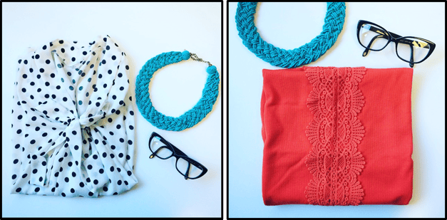
This photo trend could be a great way for you to display frames for sale in your practice. When I was searching for different examples of the flat lay trend, so many of them were fashion related. Depending on the time you want to put in, and the fashion sense you or your opticians may have, you could lay out entire outfits that are inspired by certain frames for sale in your dispensary. It was easy enough for us to take a couple photos of VisionWeb inspired outfits!

Or, to keep it more simple, you could organize photos to highlight certain brands, colors, or frame shapes. There is really an abundance of ways you can showcase the frames in your practice through photography. Just sitting at my desk I was able to find a neutral background and several props for these flat lay examples. While the photo quality could have been a little stronger, it goes to show how quickly and easily anyone can get started using this trend.
Tips for Getting Started
Find a Simple Background - Having a background that is not too busy will help keep the focus of the image on the products. Some common backgrounds include woodgrain, white space, tabletops, or colored sheets.
Natural Light - You'll want to create even lighting for your shot, which can be created best with the help of natural light. Adding light or flashes to your photos will likely create more shadows and uneven lighting.
Create Space - The way you space out the items in your photos can make a big difference in the appearance. You may go with a more mathematical and symmetrical layout, or a unique layout that offers balance in the photo without being 100% symmetrical. In addition, choosing items of different sizes is going to affect your choices for spacing in your photo.

Take Advantage of Editing Apps - Editing apps can make just about anyone a professional photographer, right? While that's not really the case, apps are a great way to make your photos look more polished, consistent, and professional. Plus, there are a ton of free apps out there to choose from, just don't get too filter-happy!
For more optical resources and design hacks for your practice, follow us on Facebook!

