What Does Your Practice Logo Say about You?
We know that taking care of your optometry patients and making a profit are two of the most important things going on in your eyecare practice. Sometimes, your optical marketing, can get a little neglected when your schedule is busy. Our Visual Designer, Sarah Hood, is sharing some tips and advice for creating a logo that represents your practice. Your logo is the first thing many patients see, and with so many different styles and designs out there, it can be a lot to think about.
Whether you realize it or not, every decision made when designing a logo says something about you and can influence the decisions of potential new patients. Something as simple as a shade of blue could sway the viewer to want to make an appointment with your practice. Here, we created a few example logos to help explain some of the different feelings that could be interpreted from each design.
5 Logo Characteristics for Eyecare Practices
1. Simple

In this Westlake Optometry example, a classic and universal font is used to help ensure the logo will be timeless. The use of thin lines and contrasting neutral colors that still have some personality, make the logo very clear as to what the name of the practice is, and is still interesting to look at. The abstract eye icon to the left reiterates that the logo is for an eyecare practice, and is a design element that can be used on it's own for other collateral pieces.
2. Clever

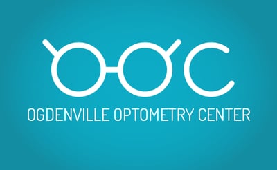
Clever wordplay or visuals are a good way to make a logo memorable, and helps show some personality for your practice. While not everyone may recognize the clever side of your logo, it will really resonate with some people and leave a lasting impression. If you have the opportunity to bring in some optometry iconography with your logo, like in this Ogdenville Optometry Center example, the eyeglass icon brings a fun and modern twist to a simple practice name.
3. Modern

This Vision PLUS+ logo is a great example of something fun, vibrant, and modern in design. The bright color palette is a great choice, without the use of too many colors. Too many colors can make a brand hard to recognize, and can make printing more difficult and expensive. The flat design style and slab serif font are both current design trends. Be careful not to overuse trendy design elements or your logo could become dated more quickly.
4. Traditional

This practice example uses a set of colors and fonts that give the practice a traditional and professional feel. While there is nothing wrong with classic fonts and darker colors, they can make a practice look more aged, traditional, or corporate. Depending on your demographics and target market, this could be a more realistic option for your practice. If you're going to use the doctor's full name in the practice name, you should consider including optometry related words so that the practice isn't easily confused for a law or accounting firm on first glance. Plus, the use of eyecare related terms in your practice name will help with your SEO. The use of a doctor's name in your logo is a good option in the case of an established reputation.
5. Dated

This Rolling Hills Eyecare logo is an example of a logo that comes across a little dated or amateur in design. Treatments and gradients are overused, and the logo even appears to be stretched which is a big design no-no. The logo also looks very much like clip art, and isn't a good representation of the eyecare practice itself. In this case, the logo could definitely use a re-boost to help it work harder for your practice bringing in more new patients.
We know that was a lot to think about. Here are a few references we linked to in this article that might help you understand some of the more current design trends:
- Understanding Serif and Sans Serif Fonts
- An In Depth Look at Understanding Flat Design
- The Design Blog
Get more tips for running the marketing and strategy of your practice with OD Handbook: Small Business, Big Profits.
Originally published in June 2015

