A Journey Through the Newly Enhanced Uprise Invoice

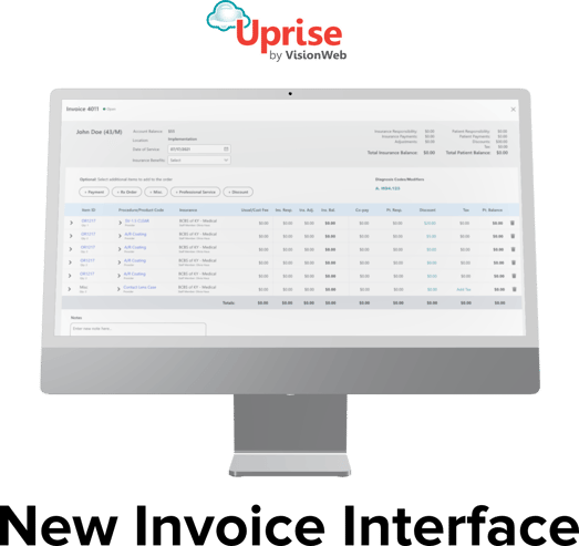
One of the most frustrating aspects of any Practice Management system is dealing with financial reporting inaccuracies and a clunky user interface of its invoice. Today, we are excited to announce our newly redesigned invoice, which addresses these common pain points, and brings a refreshed modern feel. Generating and analyzing charges has never been easier for you and your staff, as our invoice effortlessly guides your eyes through each transaction.
Let’s delve into the exciting new features and changes of Uprise's new invoice and explore how it can benefit your practice:
Refreshed Theory-Based Design
Right from the start, you'll notice significant improvements in the design. These enhancements go beyond just a fresh coat of paint. They have been thoughtfully crafted utilizing design theories, such as the principles of proximity and color theory, at every layer:
1. Header & Footer Layer
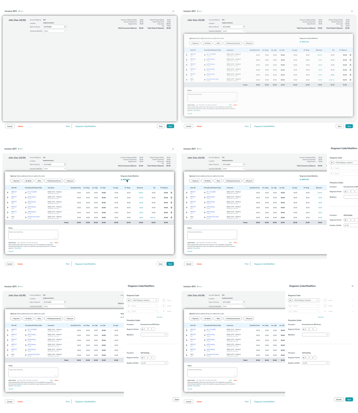
The header and footer layer showcases a white background and clean headers, telling the user exactly what the invoice is. This layer houses the primary buttons and serves as intuitive markers which guide your interaction with the invoice at the highest level. Additionally, users can now delete open invoices, providing the flexibility to treat an open invoice as a draft for a seamless and efficient invoice management experience.

2. Patient Overview Layer
As we move inward, the invoice information gradually becomes more specific. The patient overview layer is signified with a gray background and houses high-level patient information. This layer features a brand new "balance roll-up" section which grants the ability to quickly review pertinent patient and invoice totals, and effortlessly access a breakdown of individual insurance balances with just a single click.
3. Details Layer
The final layer boasts a familiar white background in the middle, where patient-specific details come into focus. Returning to the white background reinforces the hierarchy of importance in the overall layout and houses the most specific invoice information.
The diagnosis codes and modifiers have relocated to the top of this section for better visibility. You can now easily make adjustments to these codes/modifiers, create discounts, or add tax by selecting the blue and teal-colored hyperlinks. This action reveals a sleek slide-out modal for quick editing, eliminating the need for annoying pop-up windows. Additionally, Users will reduce re-work and save time with the new ability to change insurance directly from the invoice.
The redesigned details grid now allows you to see every transaction at a glance and reduces clicks by eliminating the need to tediously select each row's ledger. The header boasts a light blue color which is typically associated with peace, relaxation, and healthcare. This color change makes the multiple header options easily digestible and naturally draws your eyes downward to their respective fields. Finally, at the bottom, you'll find a familiar gray “totals” line, emphasizing a similar hierarchy of high-level items in the Patient Overview Layer.
Improved Financial Reporting Integrity and Claims Processing Reliability:
While the refreshed user interface is important, we haven't stopped there. We have made additional feature enhancements to ensure accurate financial reporting integrity. Previously available invoice items on the back end have been fine-tuned to equip your practice with the most efficient reporting safeguards in maintaining a healthy financial workflow. These updates ultimately empower you to ensure accurate reporting practices and reliable claims processing when managing your practice's financial transactions.
Modern Solutions Elevating Practice Management
These new and upcoming features and enhancements represent our commitment to providing cutting-edge practice management and clinical tools for eye care professionals. We're excited to see how it'll streamline your daily workflows and help you focus on what really matters - providing excellent care to your patients.
To find out more about Uprise EHR & Practice Management, schedule a call with our team

