Optical Marketing: How to Create a High Converting Facebook Cover Image
Having your business on Facebook is the norm these days. But simply "being on Facebook" isn't enough anymore. Having a successful Facebook Page for your business takes a little bit of time and effort so that you can build an engaged community of followers, and ultimately increase appointments scheduled in your practice.
Our friends at 4PatientCare recently wrote an article that we want to share with you about the elements that make up a high converting Facebook cover image. If you think your practice could be doing more to help the growth and engagement of your Business Page, read up and start by creating a memorable cover photo!
3 Elements of a Powerful Facebook Cover Image that Will Boost Your Optical Marketing
One of the goals of your Facebook page should be to increase booked appointments. Your Facebook page should provide all your visitors the opportunity to schedule an appointment right then and there. If your current cover photo doesn't provide the ability for your visitors to take this action, you're leaving money on the table.
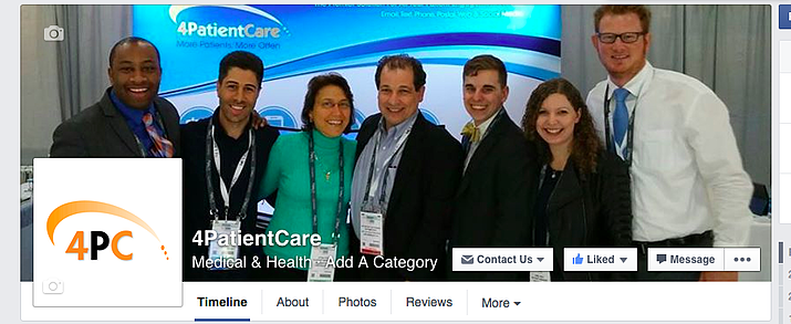
To start, your cover photo is that big image across the top of your page.

A while ago, you weren't able to use your cover photo to advertise at all, but Facebook has loosened up their guidelines. Keep in mind though that getting too "sales-y" in your cover photo can make you look pushy, money hungry, or tacky. Not good qualities. It can be a tricky balancing act, so we've put together some simple guidelines to help you navigate the slippery slope of Facebook without coming off like a used care salesman.
Dimensions and Alignment
Your cover photo is the first thing people see when they come to your page, making it super important to make sure that it's not just a jumbled mess. Here's a few things to keep in mind:
- Cover photo dimensions are 851 x 315
- Stronger images are right aligned. Since your profile photo is on the left, make sure that your whole page is balanced by keeping the bulk of the content on the right side. Though centered images can work too. It's a good tip to keep in mind when using text or asymmetrical images. Also make your that your profile picture or buttons aren't covering any text you may have on your cover photo.
- Integrate other aspects of your page. Just because you want to avoid getting crazy with hard sales in your cover photo does not mean you can't highlight or bring attention to areas of your page designed specifically for that reason. Draw your visitors' eyes to your call to action button by framing that area with a simple message or arrow.
Stay Visual
Have you ever landed on a website, saw nothing but text, skimmed a bit, and then gave up? it happens a lot. Blocks of text can be overwhelming and discouraging. Images are much more engaging and welcoming. Just because Facebook now allows more text in your cover photo doesn't mean you should use it. When you do use text, use it sparingly and intentionally. If you have something special going on, by all means share it in your cover photo, but be precise in how you share it. When in doubt; show, don't tell.
Call to Action
Your call to action is the most important element of your page. It is the element that will allow your visitors to actually book an appointment with your practice, which it what we are defining as a success.

There are two ways to do this with your cover photo:
- The call to action button. If you have not activated this on yoru page yet, do it now. It's probably the most powerful tool available to you within the Facebook platform. it take no more than 2 minutes to activate, which is also about how long it will take a patient to schedule an appointment after they click it.
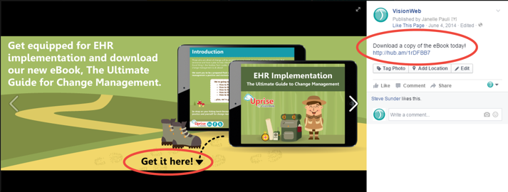
You'll see a button located in the bottom right corner of your cover photo that says, "Create a Call to Action". Select the "Book Now" option from the drop down menu and input your web scheduling link in both the website and mobile fields. Click "next". Select iOS destination by selecting "Website", and do the same with the Android destination. That's it! - Add a link in your cover photo description. When you change your cover photo you have the opportunity to add a description to it. In the description you can add a few details about your practice or current specials you have running, and include a link that will take patients to your online scheduler.
Every time you update your cover photo make sure you include a description that has a link to your scheduler. The great thing about uploading a new cover photo is that it gets out into your follower's newsfeeds and they'll be reminded of your practice. The more interactions you have on your cover photo the more people will see it!
For more optical marketing resources, subscribe to the blog!
